Restaurant Floor Plan: How To Make Yours Work For You
Elise Musumano
5 min read
Nov 6, 2018

Elise Musumano
5 min read
Nov 6, 2018

When you first outline a restaurant floor plan, you’re focused on optimizing your operations based on the way you set up your tables.
But a digital floor plan can do this every day. It can become a vehicle to track statuses and operate faster while in-service. How? By becoming your interface for reservation and seating management.
So when you evaluate vendors to manage your reservations, look for these capabilities:
When a party first arrives at the host stand, your host should be able to quickly drag and place the reservation onto an available table. This allows the host to document the seating assignment for other operations staff and then quickly seat the party without skipping a beat.
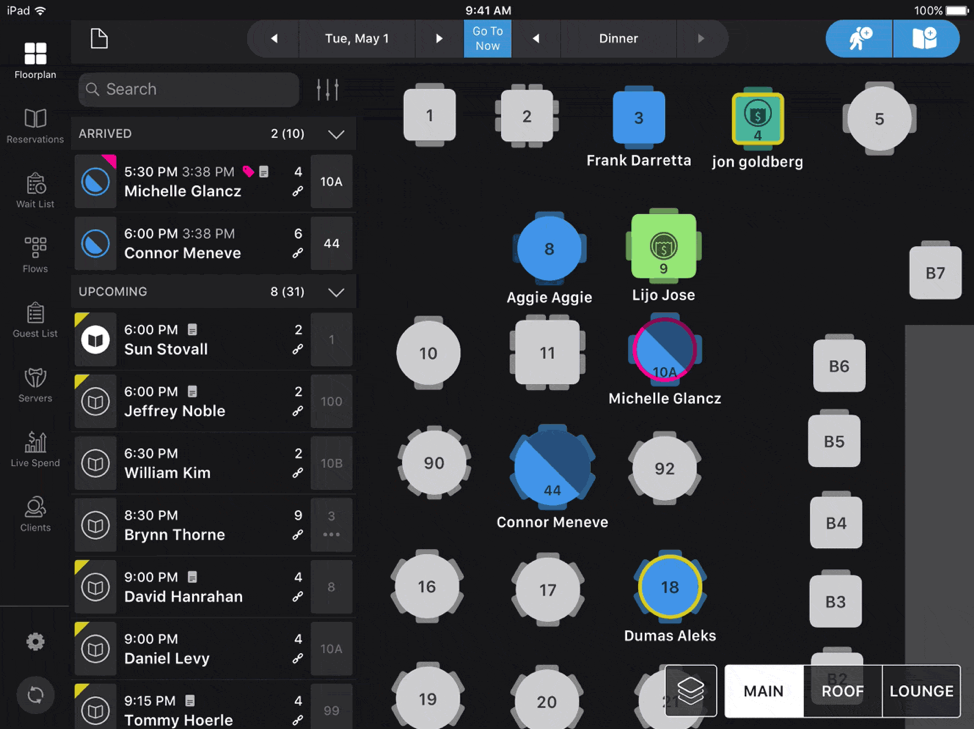
The human brain can process images in 13 milliseconds. That’s 0.013 seconds.
And it’s color, shapes, and orientation that help us do this.
When it comes to a restaurant floor plan, these things can call out important information at a glance, helping servers, hosts, maitre d’s, kitchen staff, and GMs to understand more about who’s seated at any given moment. The first of these is table status.
The most advanced seating management systems allow restaurant staff to double-click on a table to quickly update table status like seated, food served, paid, and left.
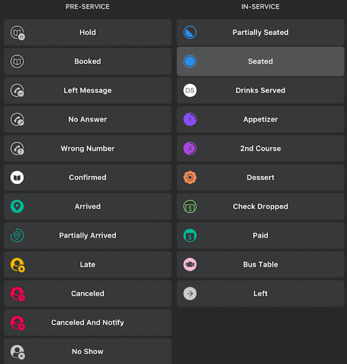
Even more interesting: Some platforms integrate with POS systems, updating table status in real-time, and automatically, when a check is dropped and then when it’s paid.
Get Your Demo Of SevenRooms Today To Get The Full Scoop
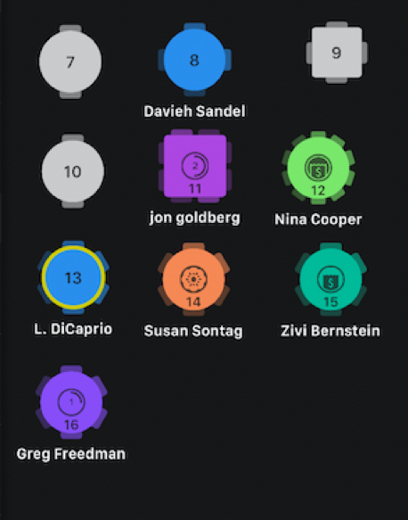
The best floor plans make it easy for waitstaff to see who’s seated across the entire floor.
They do this in two ways:
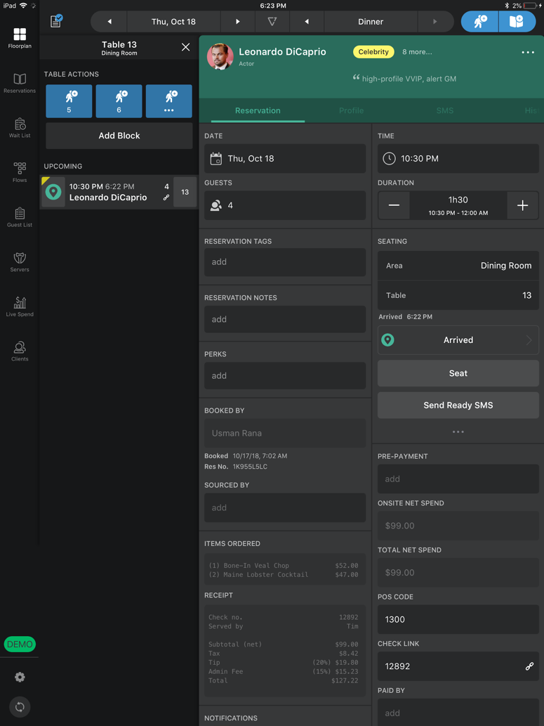
Here is an example of names with VIP tables outlined in yellow (in this case, Leo DiCaprio’s):
If you click into Leo’s table from the floor plan, you see this:
Which brings us to the next point. A floor plan should track each table’s spend in real-time.
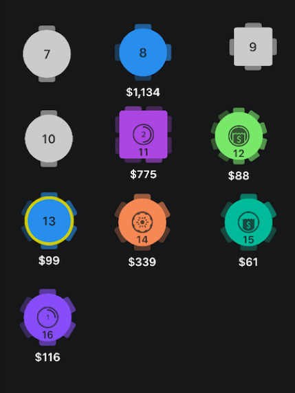
Let’s say you want to see how much each party that’s seated has spent during their reservation. You should be able to switch to a view of your floor plan that highlights that information for you.
For example, here’s what it looks like on the SevenRooms platform:
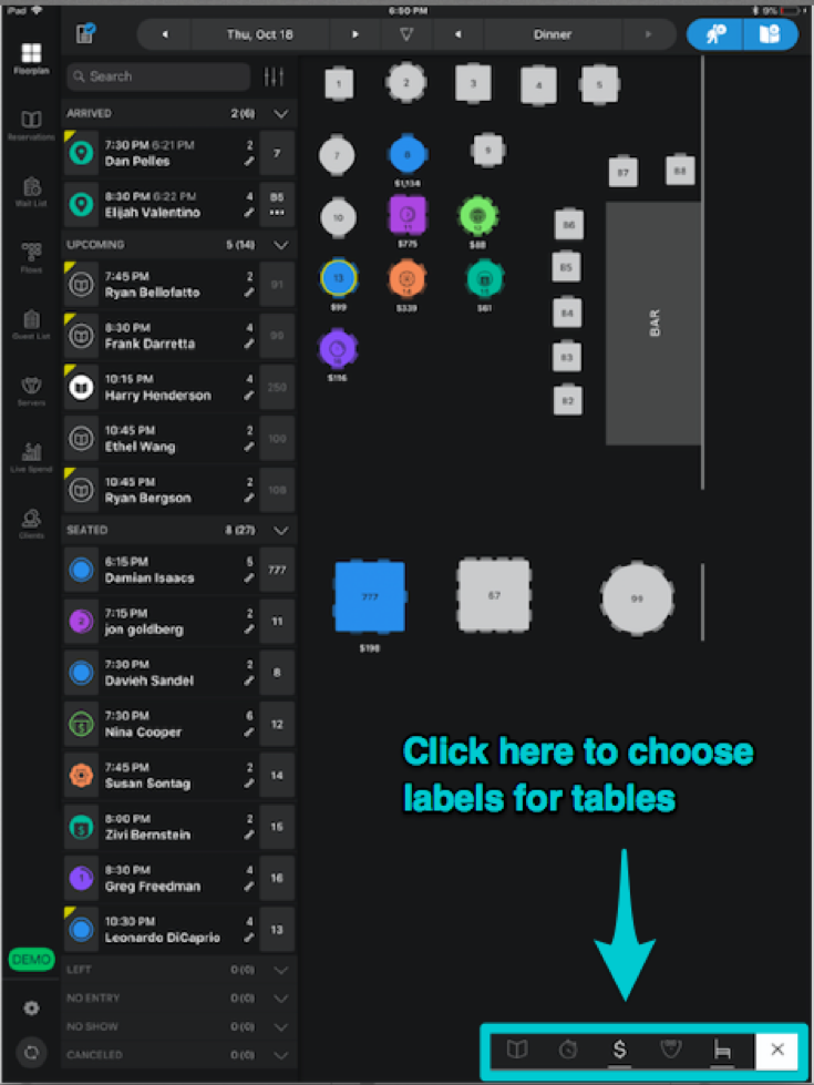
Users can click a button to expand to these label options to choose from. The dollar sign option switches to a live spend view that updates each table’s spend in real-time, pulling from the restaurant’s POS system.
Live spend helps in-service staff and managers, whether on-site or off-site, to better gauge shift revenue.
Often times, the floor plan links to a different report that organizes real-time table spend from highest to lowest spenders.
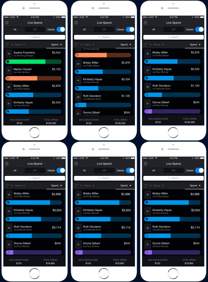
This is especially helpful for an owner or GM who wants to keep tabs on revenue as it happens — maybe even pop over to say hello to a high-spender who is a new face in the establishment.
Whether a guest at the host stand requests their favorite server, or a hostess wants to equally distribute party numbers to each server, you need to be able to quickly view server assignments.
In this example, the pink “DT” tags on each table highlight server Danielle Thomas’ section:

If we pull back to look at the entire restaurant floor plan, you’ll see other server sections. Right now, there are two servers with the initials “SE” — Shelly Ennis and Sam Edgar (this is where color-coding comes in handy), as well as a “PL” for Peter Lewiston.
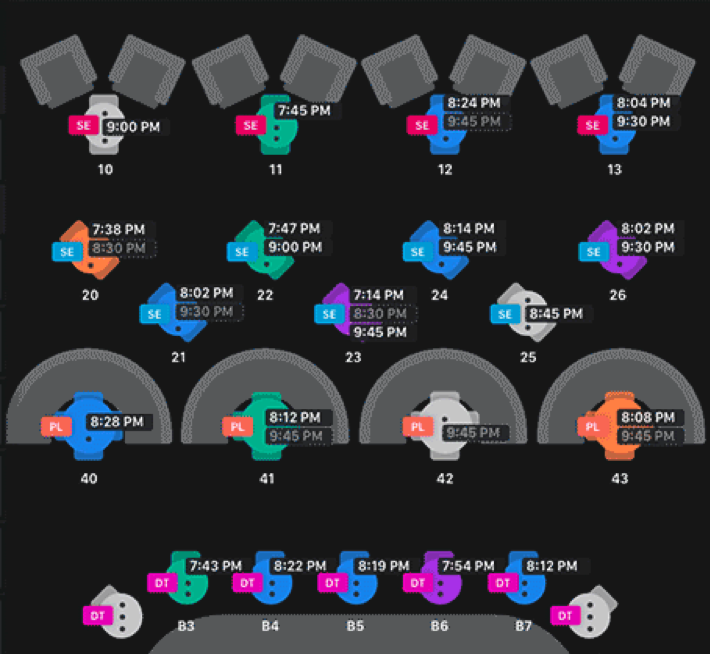
Let’s say a guest drops by your restaurant looking for a reservation later in the evening. You should be able to easily view upcoming reservation times and then click on a table that will open up later in the night to add a reservation right there.
SevenRooms allows you to do this in the view above. If a party of two wants a reservation for 8PM, you could assign them to table 11 because the turn time is set for 7:45. Learn more about how to automatically optimize your turn times to get more guests in the door with our free Revenue Management Guide.

Playbooks & Guides
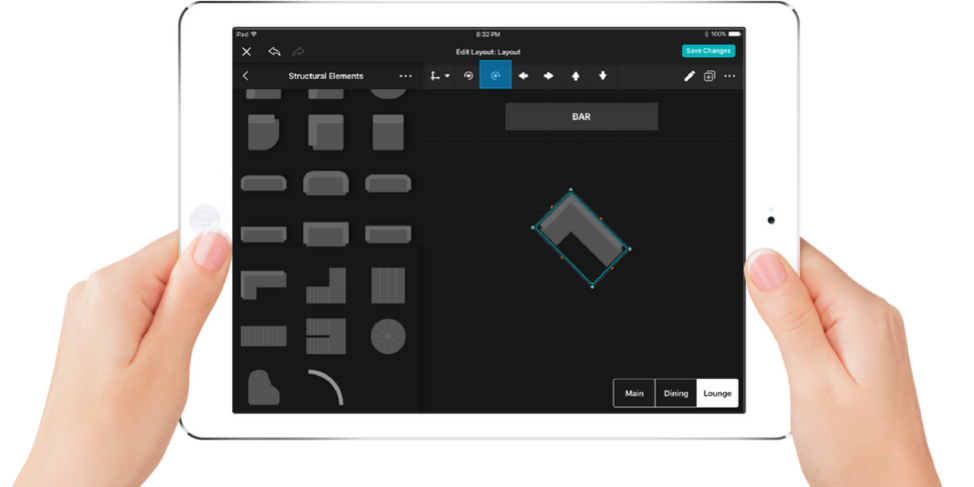
The following are quick tips to keep in mind as you think about making your restaurant floor plan digital:
You should be able to do things like create new tables, rotate them easily when you want to try a new layout, and add structures like a bar area.
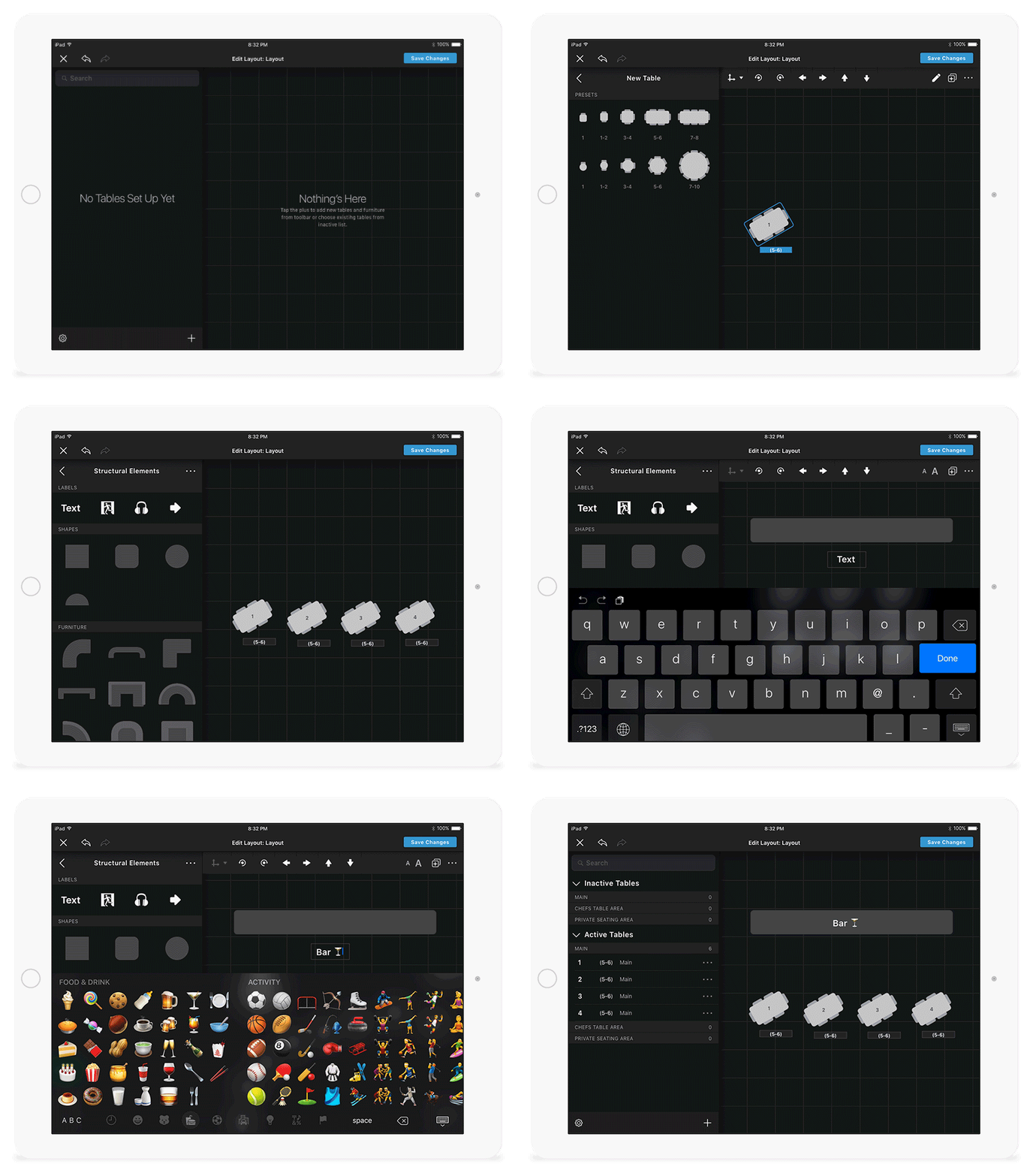
It’s more important for a digital floor plan to be functional than for it to be exactly to scale.
The fact is, your operations staff know the layout of your restaurant. They aren’t using the floor plan as a blueprint to see the layout of your restaurant as much as they are to update statuses.
For example: let’s say your tables actually sit in a line, but it’s hard for the labels to fit that way on the floor plan. It’s okay to have the tables be represented on a slant (see above).
Pro Tip: Make your table label fields the width of the longest label (whether it’s table number, server name, arrival time, etc).
This makes it extremely easy for your host stand to add new reservations directly to your floor plan – whether it be walkins or changing a table assignment for an existing party.
Maybe you include your upstairs in one view, outdoor area in another, and lower level in a third.
Whatever you do, you want to make it easy for your front-of-house staff to easily see the floor plan in one view, without having to swipe around to move their perspective.
If you can’t fit the full floor into one view, it’s easy to bundle seating areas into their own separate plans that you can use toggle buttons to quickly switch from one to another.
If someone at the host stand needs to add a walk-in reservation or seat an arrival, it’s important to be able to quickly know how many covers each table can fit.
So in addition to showing whether a table is square, circular, or rectangular, you also need to see number of chairs and ability to combine tables.
Did you know? SevenRooms offers everything above. Get your personalized demo today.