DIY Menu Design for Restaurant Owners
Bianca Esmond
5 min read
Jul 31, 2019

Bianca Esmond
5 min read
Jul 31, 2019

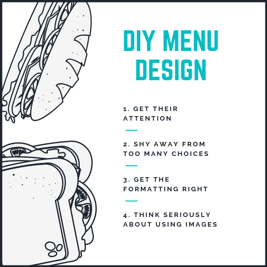
 1. Get Their Attention
The menu may be the first interaction a potential customer has with your restaurant, so you need to make a great first impression and keep it long enough to get them through the door. Yet, today’s consumers are more distracted than ever. A Nature’s Communication study explains, “Since the available amount of attention remains more or less the same, the result is that people are more rapidly made aware of something happening and lose interest more quickly. “ This means, your menu is competing for attention with social media, text messages, phone calls and more — both in-person and online. To keep your customer’s attention, use white space intentionally. White space is simply unused space with no images or text. DesignModo explains why this can help keep your customer’s attention: “White space exists for a reason — to ease the process of analyzing graphics or content so this is what you have to remember while using it in graphic design. The human eye percepts an organized and clean layout better than a cluttered space full of visual disturbances.” With fewer distractions, your customer can focus on reading the menu.
One way to declutter your menu is to include fewer options. Reducing your total menu options also encourages customers to make a decision, rather than getting overwhelmed and choosing to go somewhere else. A now-famous jam experiment proved this, in which customers saw two displays of jam every day — one with 24 varieties and one with just six. “The large display attracted more interest than the small one. But when the time came to purchase, people who saw the large display were one-tenth as likely to buy as people who saw the small display,” explains Barry Schwartz, professor of psychology at Swarthmore College. If you’re having a hard time leaving items off the menu, consider building buzz with a “secret menu,” like many famous brands, including In-N-Out and Starbucks. As you prepare to open, tease the “secret menu” to get people excited about trying all of your food—both on and off the menu.
The way in which you format the layout of your menu affects the way potential customers will flow through it, in addition to what they notice first. According to My Creative Shop, when looking at a piece of paper “your eye automatically goes from the top left to right and then the center,” so it’s imperative that you place high-value items in these ‘prime’ areas of your menu. This area is called the golden triangle, and it can be used to anchor your customers’ perceptions of the rest of your menu. For example, if they see expensive menu items first, they’re more likely to see the rest of your pricing as more affordable. Use this area wisely and know your brand and target customer when choosing how to make the most of the golden triangle. If you appeal to a price-conscious diner, placing your most expensive items in this space could turn them away from your restaurant, rather than encouraging them to come in.
Images can help customers understand a dish better, but they should be used sparingly, if at all. Design experts at 99Designs explain, “Photos of food are more commonly associated with junk mail fliers and big chain restaurants like Denny’s; not high-end restaurants. If you do use photos, they must be of extremely high professional quality, which may be costly. In general, it’s better to leave the quality of the food to the customer’s imagination, because not all food photography will appeal to everyone.” Again, consider the clientele of your restaurant along with your brand. Do images fit with the type of restaurant you’re running, or should they be left off altogether? If photos aren’t a good fit for your menu, consider how you can use high-quality food images to build your social media audience instead.
If your budget doesn’t allow for a designer, use these menu psychology and basic design tips to create a menu that will help your business stand out. When you get the formatting, layout and images correct, you’ll make it easy for customers to choose your restaurant time and time again.