4 Keys To The Best Restaurant Websites
Molly Weinberg
5 min read
Aug 9, 2018

Molly Weinberg
5 min read
Aug 9, 2018

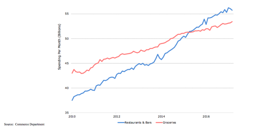
The best restaurant websites understand that their online presence is crucial to their success. If you’re reading this post, you do too. Your website is where your business lives online, which is where consumers spend the majority of their time. According to a report in the MIT Technology Review, since 2000, time spent online every week by an average American has risen from 9.4 hours to 23.6. That’s a lot of screen time, and you better believe they are using those hours to decide where they are going to eat. In fact, money spent on dining out is at an all-time high, surpassing grocery sales for the first time in 2015.
Here are four key strategies we’ve observed across the best restaurant websites that we invite you to consider in order to avoid common restaurant website mistakes.
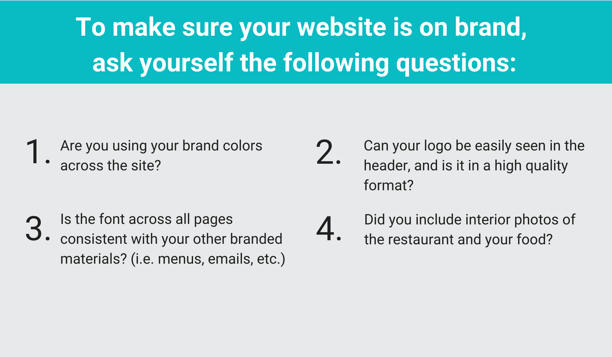
Your website should be a direct reflection of the brand and aesthetic guests experience when they are physically in your restaurant. You will want to make sure your authentic brand is expressed across your site to help you stand out from the competition. Plus, when searching for restaurants, consumers only spend a few seconds on the homepage of the website, so you want to be able to capture their attention right away. Whether they’re a new guest or a repeat visitor, you want to put your best foot forward to make a lasting impression with your restaurant’s customers.
Speaking of photography, this brings us to our second key to success – it’s all about the images.
The types of images you put on your site also help to express your brand. Including beautiful, high quality imagery of your interior and food helps tell the story of your restaurant and cuisine, enticing guests to come in and try it for themselves.
Image quality is determined by many factors but the most important hands-down is resolution. The higher the resolution the more detail in the image, which means it is clearer to the viewer. Specifically, digital images are made up of thousands of pixels (blocks of color), and the number of pixels in the image will determine how high the image’s resolution is.
Best Practices:
Plus, there’s some science behind it. The human mind is more accustomed to processing images—ninety percent of the information sent to the brain is visual. You might be asking yourself how many images should you include. In our opinion, there’s no limit, but quality definitely takes precedence over quantity and each image should be consistent with your branding.
Example: COTE Korean Steakhouse, New York City
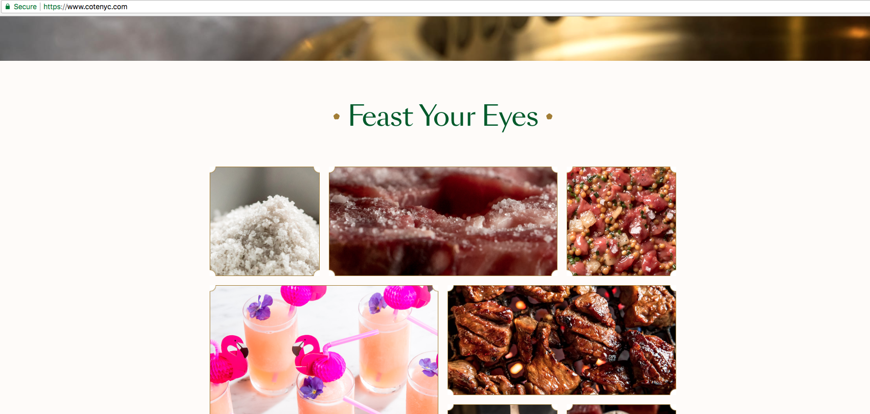
Here are a few ways to incorporate imagery on your website:
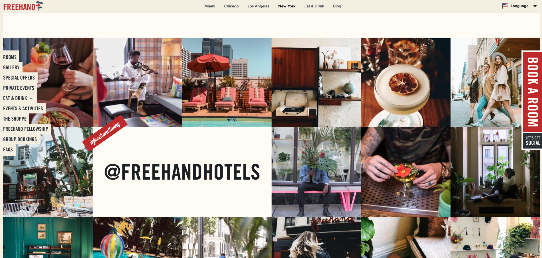
Example: Freehand Hotels
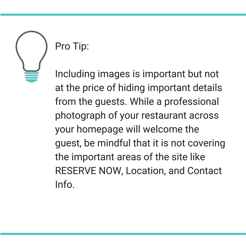
Once you’ve pulled a guest in with your branding and images, it’s time to make sure they can take action.
With the cultural shift to online reservations, your website is now the most important place to showcase and accept direct reservations.
But the good news is you don’t need to be a tech guru or build your own reservations system. You have options, just be sure to pick the right reservation functionality for your restaurant.
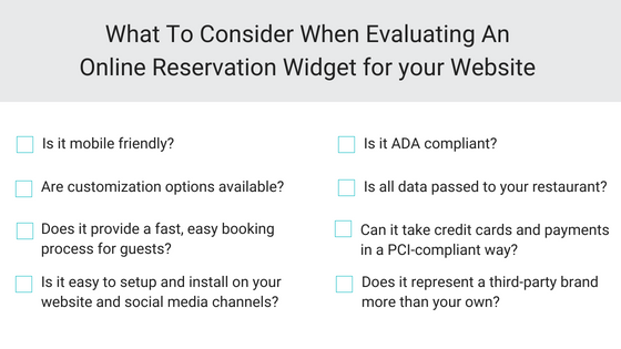
Want to see all of the above in action? Request a demo with SevenRooms.
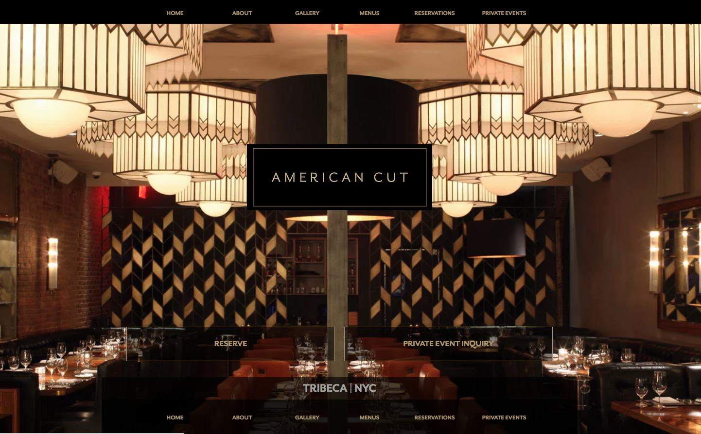
Once you pick your reservation system, make sure you implement a reservation widget appropriately on your website. Provide a visible call-to action (CTA) button for reservations in your global navigation — don’t make users work to locate it on your site.
Additionally, it doesn’t hurt to have actionable RESERVE NOW links across your site to continue to drive people to book directly or purchase (if you are selling events or special packages) as they explore your offerings.
Example: American Cut
While your booking widget will drive reservations, other aspects of your website can drive sales before guests even arrive.
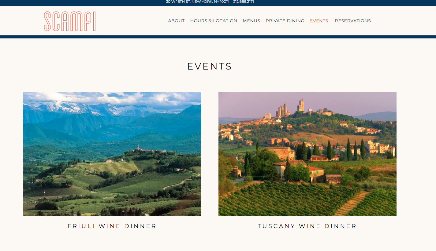
Food is still the focal point of a restaurant, but the total ‘experience’ is quickly becoming just as important. Nearly three out of four millennials prefer to spend money on experiences rather than material goods. This means it’s time to present custom experiences to your guests on your website to capture their attention. The best part? You can collect payment for experiences directly from your site before the guest even arrives at the restaurant.
Consider offering the following to your guests in advance:
To make it easy for guests to find these offerings on your site, offer direct links through your navigation bar for events and gift cards, and present the upgrades during the booking experience. Technology partners offer restaurants the option to integrate these offerings into the booking experience.
Example: Scampi NYC
Your website is often times the first impression guests get of your restaurant, and first impressions count. While there are many ways to approach creating a best restaurant website, start with the options that make the most sense for your business.
Want to learn more about how SevenRooms can build your restaurant a reservations widget for your website — with your branding — and help you drive ticketed events like we do for Scampi? We want to hear from you.